However, at least in a web context it’s relatively rare to provide country menus. On the other hand, language menus are common, allowing the user the view the page in another language. Wikipedia is a good example of this.
Unfortunately, there is no accepted way to symbolise languages. Wikipedia writes the language names out in full, and other websites use two- or three-letter ISO codes.
When a graphical icon is needed, people often resort to national flags, but that really isn’t a very good solution at all: Some languages (such as English and Spanish) are used in many countries, and many countries have more than one official language (e.g., Scotland and Belgium).
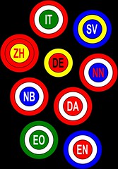
I really wish somebody would come up with some language symbols/icons that everybody could agree on. For the purpose of this blog post, I played around with the idea of using three concentric circles in various colours (loosely based on the flags of the main countries where the language is spoken), with the ISO code in the middle, but I fear they look too similar.
Perhaps using shapes as well as colour would help, but the danger is that it would be hard to identify one of the icons out of context.
Even if the whole world could agree on a set of language icons, it would still be a challenge to teach ordinary people to recognise the one associated with their native language, but it should be possible. If websites such as Wikipedia adopted them, their use would spread quickly.
It would be really useful!